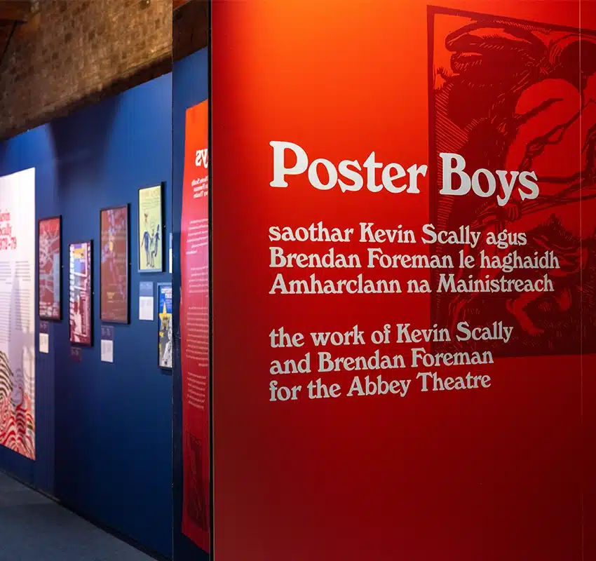
Poster Boys
Introduction
“There is a skill to creating a good poster for a play. It shouldn’t say too little, and above all, it should not say too much. The image can guide you subtly to the heart of the text and show you some of the secrets behind the writing.” – Frank McGuinness
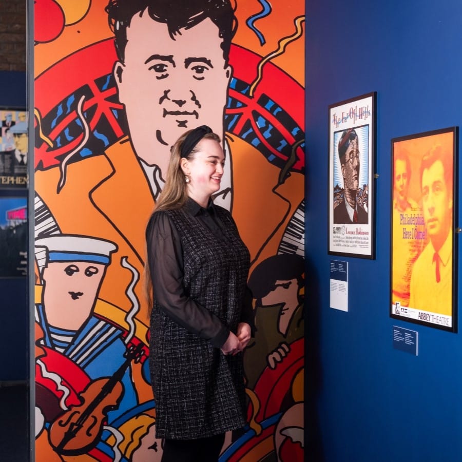
The Abbey Theatre was founded in 1904. The Peacock, a smaller venue for experimental productions, was added in 1927. The theatre was destroyed by fire in 1951 and replaced by a new building designed by the Irish architect Michael Scott.
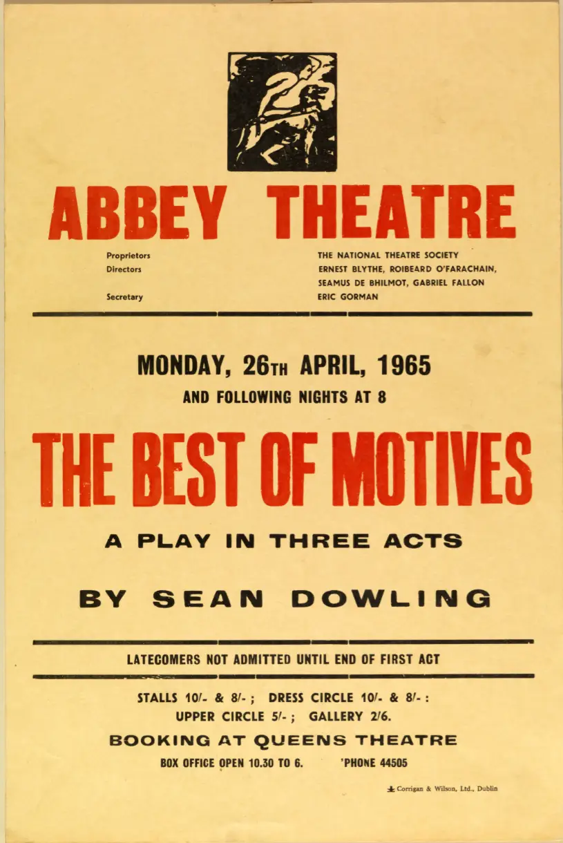
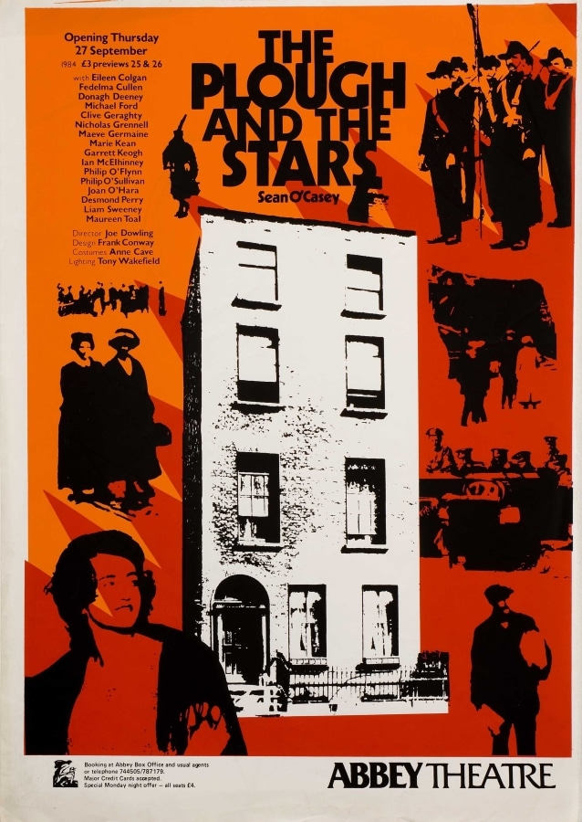
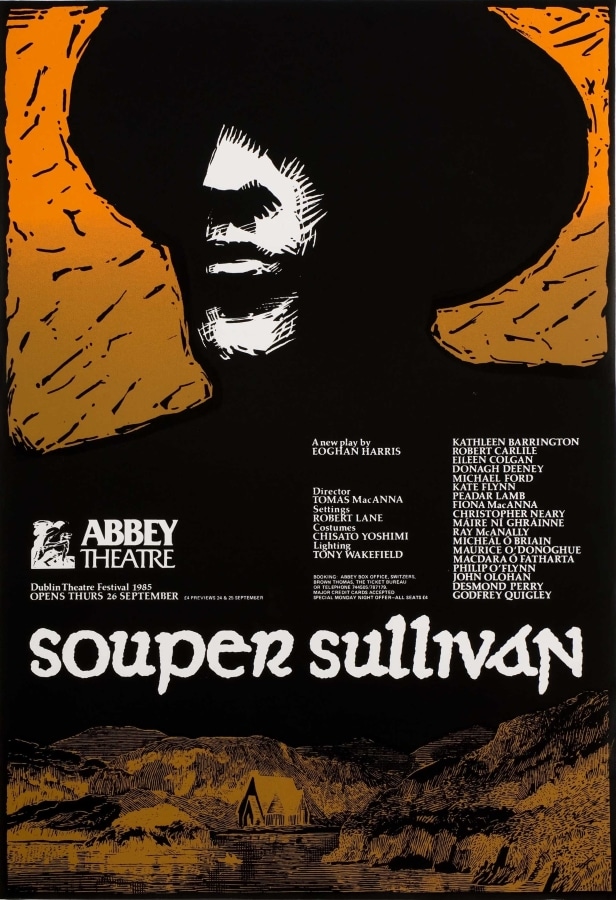
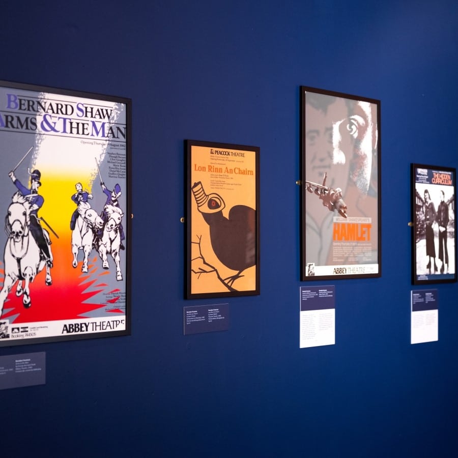
The ‘new’ Abbey opened in 1966. Glass cases were incorporated into the façade for the display of posters and photographs. At the time, posters were typically hand-written notices or letterpress playbills and these were strictly informative. In 1970s, the Abbey embraced contemporary advertising strategies, employing its first in-house graphic designer in 1972: Kevin Scally. Brendan Foreman succeeded Scally in late 1979. Collectively, their work demonstrates a vast array of visual styles and approaches.
A poster took about two weeks to produce from sketch to final print. In the 1970s and 1980s, a print ‘run’ was around 200-500 posters. The majority were hung in pubs and cafes around Dublin city. Today, the Abbey produces a small number of digital prints for display on the exterior of the building.


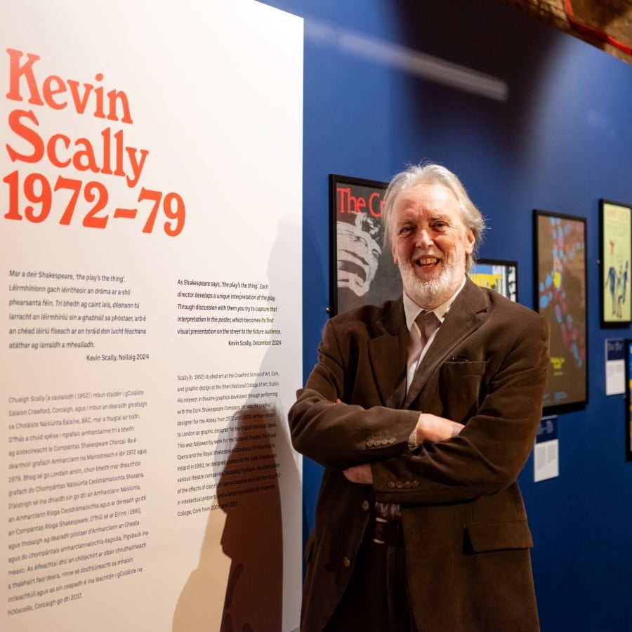
Kevin Scally
“As Shakespeare says, ‘the play’s the thing’. Each director develops a unique interpretation of the play. Through discussion with them you try to capture that interpretation in the poster, which becomes its first visual presentation on the street to the future audience.” – Kevin Scally, December 2024
Scally (b. 1952) studied art at the Crawford School of Art, Cork, and graphic design at the (then) National College of Art, Dublin. His interest in theatre graphics developed through performing with the Cork Shakespeare Company. He was the graphic designer for the Abbey from 1972 until 1979. He then moved to London as graphic designer for the English National Opera. This was followed by work for the National Theatre, the Royal Opera and the Royal Shakespeare Company. On returning to Ireland in 1990, he designed posters for the Gate Theatre and various theatre companies, including Pigsback. His observation of the effects of copyright law on creative work led him to a PhD in intellectual property and a lecturing position at University College, Cork from 2006 until 2017.

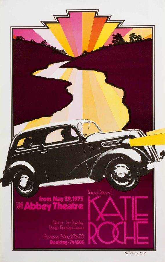

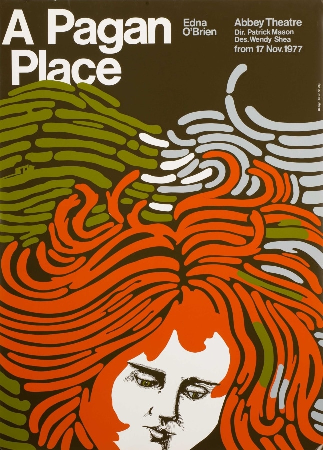
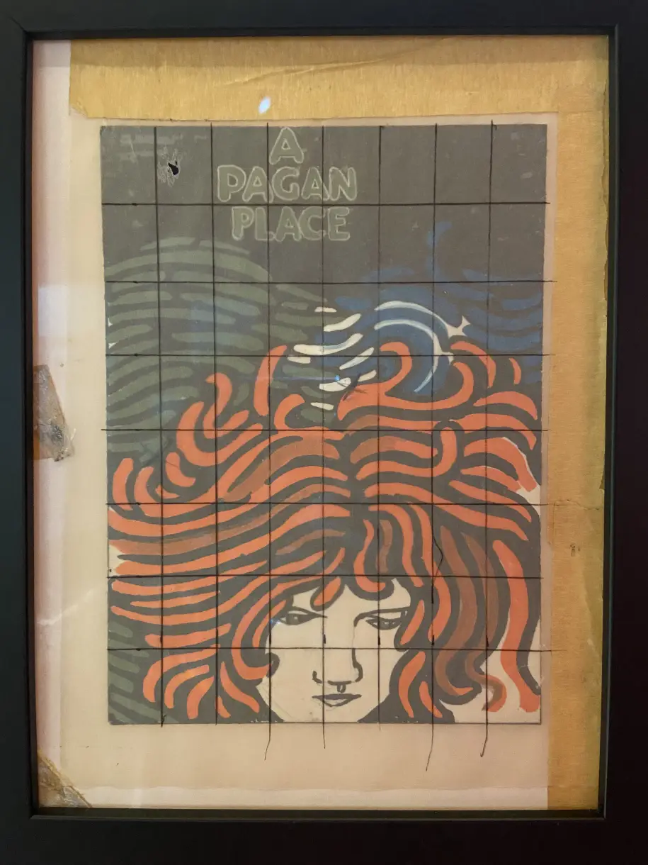
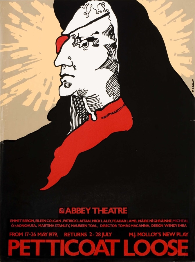
A Pagan Place
“The play is about] repression, but actually is also about looking for something beyond that, looking for freedom. So in a sense, this kind of wild landscape is in her head, and her hair merges with the land and the sea.” – Kevin Scally, December 2024
Each poster in this exhibition began as a rough sketch. Scally created this miniature gouache painting for A Pagan Place. He placed tracing paper over his sketch, onto which he drew a grid. This allowed him to scale up the original sketch to the much larger poster.
Kevin Scally
A Pagan Place by Edna O’Brien
Abbey Theatre, 1977
Printed silk-screen by Addisplay

Printing Posters for the Theatre
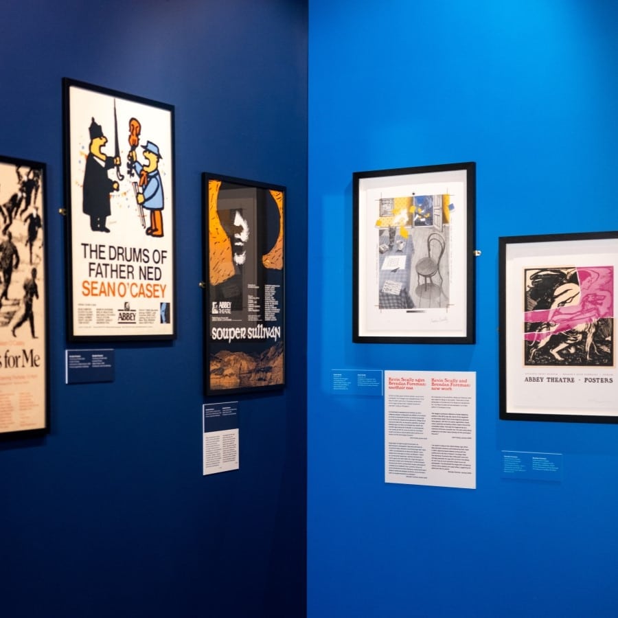
The posters in this exhibition provide a valuable record of specialist printers. Many of these businesses were in Dublin city-centre and several were close to the Abbey; most are now gone. The posters in this exhibition were printed either with silk-screen or offset-lithography processes.
Silk-screen printing was popular as a cheap way of producing short runs of posters. With this technique, an image is stencilled onto a fine mesh screen that is stretched across a frame. Ink is forced through the gaps in the screen created by the stencil and onto paper. The overlaying of inks often creates a raised impression on paper.
Offset lithography transfers (or ‘offsets’) an image from a cylindrical aluminium plate onto a rubber-covered cylinder and from this to paper. This technique can be used to create ‘spot’ (individual) colours. In full-colour lithography, four plates reduce the image to percentages of cyan, magenta, yellow and black. When combined, these create a full spectrum of colours.
1. Addisplay, Blessington Street
2. Aston Colour Print, St Stephen’s Green
3. Corrigan & Wilson, 13 Sackville Place
4. Hobson Morris & Co, Walkinstown Avenue
5. Three Candles, Aston Place, Temple Bar
6. Orchard Press, 29 The Rise, Mount Merrion
7. Sprint (later Fordprint), Marlborough Street
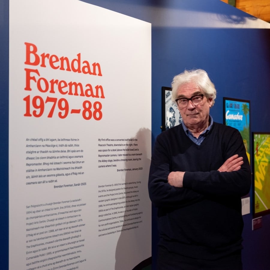
Brendan Foreman
‘My first office was a converted staff toilet in the Peacock Theatre, downstairs on the right. There was space for a desk (above the toilet bowl) and a Repromaster camera. I later moved to a room beneath the Abbey stage, beside a dressing room, leaving the camera where it was.’ – Brendan Foreman, January 2025
Brendan Foreman (b. 1954) first worked in advertising. During the 1970s, he designed posters for theatre groups, music events and the Project Arts Centre. He joined the Abbey as resident graphic designer in late 1979. Although he left in 1988, he continued designing posters for the Abbey into the 1990s as part of The Graphiconies, an Irish-Italian graphic design collective. In 1995, he was a co-founder of Public Communications Centre, a campaigning and fundraising agency for non-profit organisations. Today, he continues to design for the cultural and social sectors in Ireland (brendanforeman.com) and owns a bookshop in Terenure (thevillagebookshop.ie).


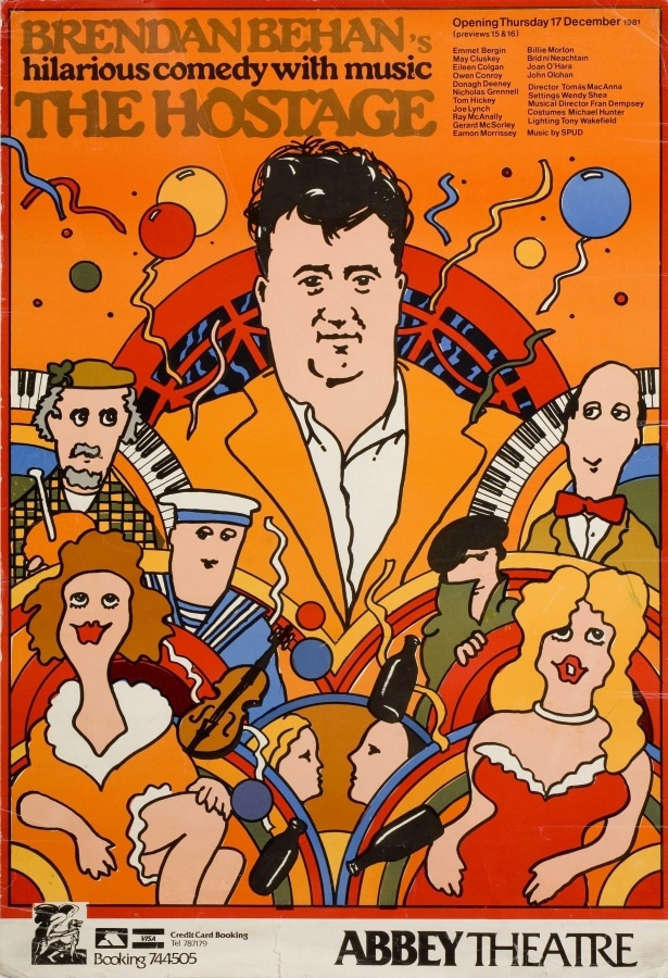


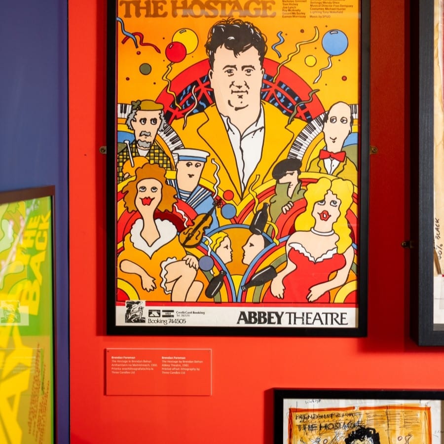
The Hostage
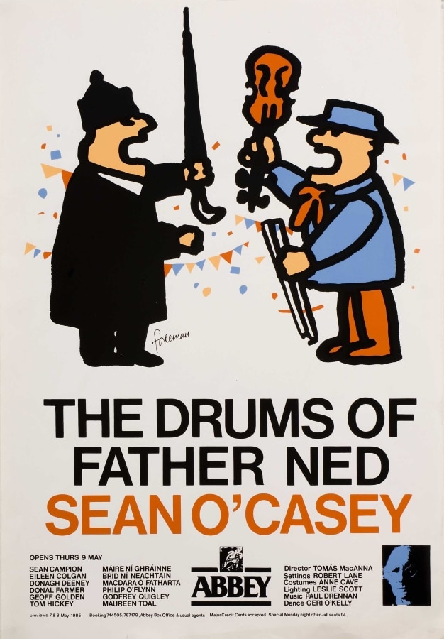
‘Director Tomás MacAnna wanted to emphasise the play’s musicality and humour in the poster. I admired the Polish designer Waldemar Świerzy and drew on his style, featuring all the various characters from the play with Behan dominant, framed by an old Dublin fanlight.’ – Brendan Foreman, January 2025
Rubylith© is a red-coloured, photo-masking film used to produce individual colour separations for printing silk-screen or offset-lithography. These are the original artwork separations – representing solid colours and tints – used in the printing of The Hostage poster. Foreman’s preliminary sketch is also displayed.

New Work
As a response to this exhibition, Scally and Foreman were each asked to design a new poster. These were printed letterpress on the National Print Museum’s Vandercook No. 4 by Mary Plunkett and are available in a limited edition in the Museum shop.
Kevin Scally
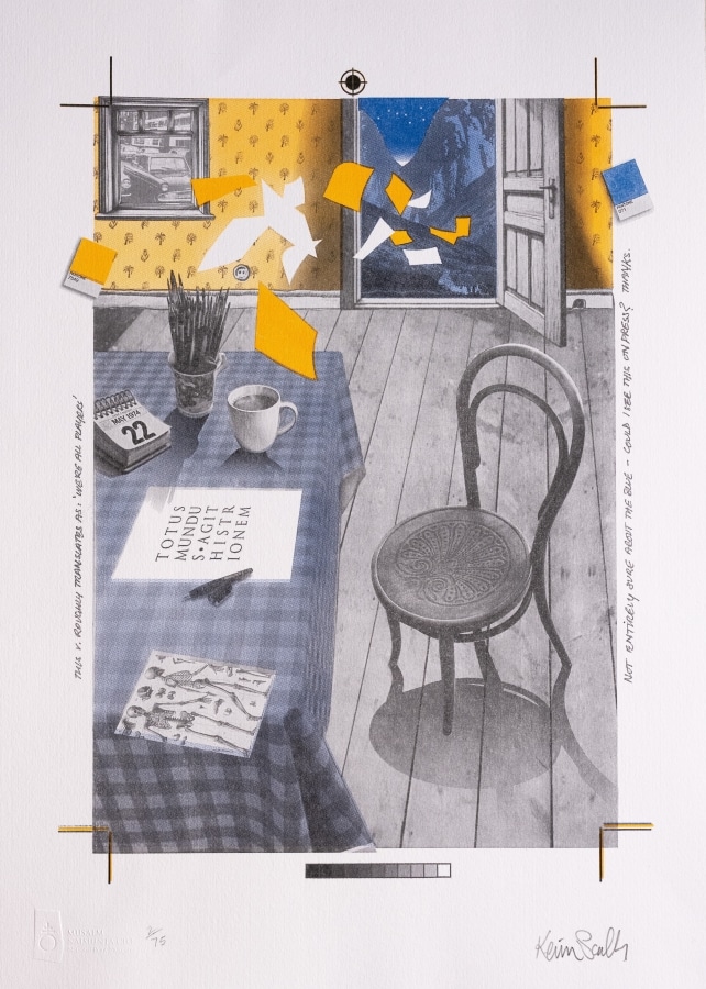
Chair No. 14
‘The image is a personal reflection of what designing posters in the 1970s was like. Much of this happened on the kitchen table! Think of the image as a personal time capsule. I left the trim marks, registration marks, colour swatches and hastily written notes to the printer completely visible. That way the image serves as a memento of the pre-computer era. The Latin motto being prepared on the table means literally ‘All the world plays the actor’.’ – Kevin Scally, October 2024

Brendan Foreman
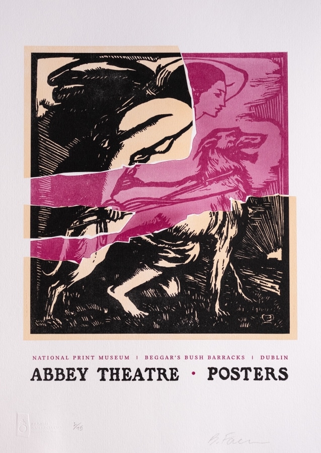
Impermanent Display
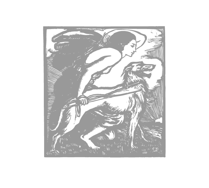
‘I’ve chosen to feature the original Abbey logo: Elinor Mary Monsell’s woodcut commissioned by W.B. Yeats in 1904, depicting Queen Maeve hunting with her wolfhound on the hills of Ireland. I’ve always liked the individual, illustrative flair of Monsell’s work and strongly associate her logo with my time in the Abbey: for me it has as much evocative impact as an old photograph. I’ve dramatised the image with contrasting colours and a stylised, torn paper effect, suggesting the ephemeral life of a poster.’ – Brendan Foreman, October 2024
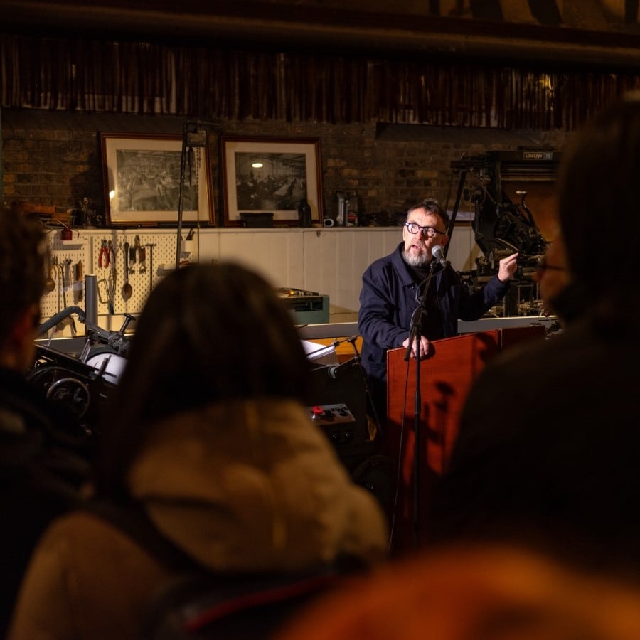
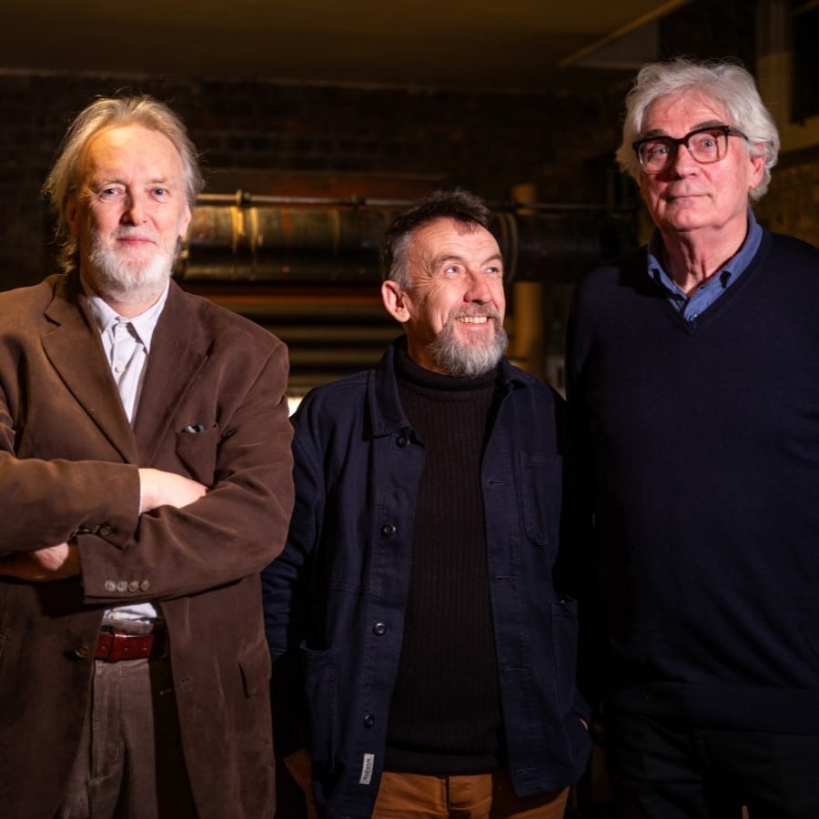
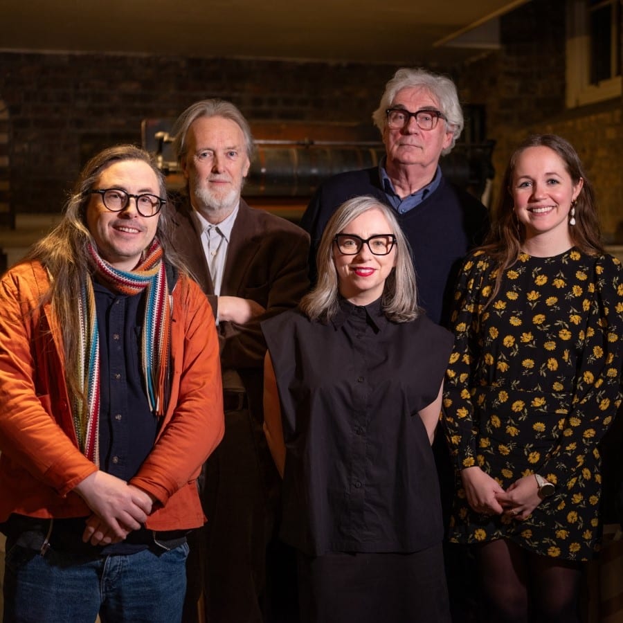
'Poster Boys' at the National Print Museum
‘Poster Boys’ was launched at the National Print Museum on 27 February 2025 by Abbey Theatre Executive Director Mark O’Brien, along with curator Dr Linda King and the poster designers themselves, Kevin Scally and Brendan Foreman.
Press
- Interview with Kevin Scally and Brendan Foreman on RTE Arena, 10 March 2025
- Article in History Ireland, Volume 33 Issue 3 (May/June 2025)
- Article in RTE Culture, 5 August 2025
- Article in TCD’s University Times, 29 August 2025
Reviews
- ‘I enjoyed the temporary exhibition Poster Boys … I found it especially novel that each poster comes with the designer’s own commentary on its creation and process. Very interesting!’
- ‘The poster exhibit was a delight to see.’
- ‘Very lovely museum, loads of fascinating letter printing machines, and a great exhibition on Abbey Theatre posters upstairs!’
Events
- Programme of curator’s tours
- 28 February 2025, exhibition launch
- 16 August 2025, curator’s tour for National Heritage Week
- 19 September 2025, panel discussion with poster designers and curator for Culture Night
- 17 November 2025, curator’s talk on the history of Irish design for Irish Design Week
Curator's Statement
‘Poster Boys’ presented a unique opportunity to add new perspectives on the history of the Abbey Theatre. Placing emphasis on its posters draws attention to the graphic designers that imagined them and the Dublin printing companies that produced them.
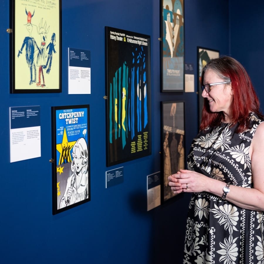
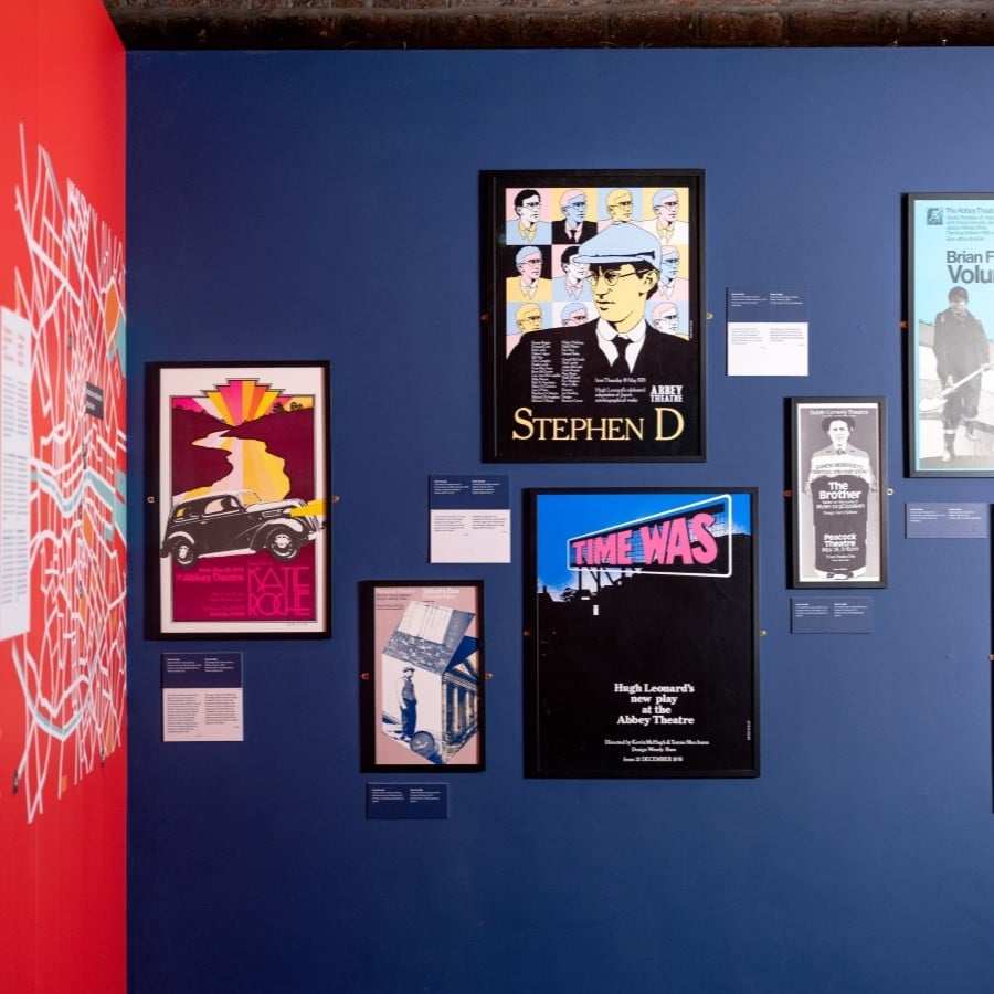
Curatorial choices were carefully considered. The walls were painted deep blue to mirror the colour of the night sky (when a lot of theatre-going takes place). It also referenced the darkness of an auditorium, drawing attention to the posters as ‘pops’ of colour, like actors illuminated on a stage. The posters were not hung in a straight line, but were visually staggered to reference how they would have originally been viewed on Dublin streets.
Windsor was the typeface chosen by the exhibition designer for the headline captions: designed by Elisha Pechey for the Stephenson & Blake type foundry (1905), it was used on the cover of early Abbey Theatre programmes and in some of the posters in this exhibition. A sketch for Scally’s A Pagan Place and artwork for Foreman’s The Hostage were displayed alongside the final posters to draw attention to the process of designing.
Finally, an additional layer of captions underneath most of the posters, captured the voices of Scally and Foreman, reflecting their experiences and inspirations.
Exhibition Credits
Curation: Dr Linda King
Design: Niall McCormack
Project Management: Abby Westover
Lenders: National Library of Ireland and Abbey Theatre Archives
Digital Exhibition
Build: Open Design & Digital
Supported by: the Department of Culture, Communications and Sport &
the Design and Crafts Council of Ireland
Physical Exhibition
Digital Displays: Rob Reid, ThoughtDifferent
Irish Translation: Clare Rowland
Framing: Phoenix Framers
Print: McGowans Print
Installation: Anika Kidd and Cameron Brady
Special thanks to: Kevin Scally; Brendan Foreman; Mairéad Delaney, Abbey Theatre; Gavin Leane, RTÉ Archives; Dr Audrey Whitty, Andrew Megaw and Maria Montcalm, National Library of Ireland; Brian Heffernan, Aad/Wove; Darren Flynn, Flexographic Plate Plan; Susan Leen; Melania Marra; Mary Plunkett, Aoife Cosgrove, and Carla Marrinan-Funder, National Print Museum.
![]()
![]()
In memory of Brendan Foreman, 1954 - 2026

Print Shop
Discover a selection of letterpress prints made at the Museum, or browse through books exploring print and design history.
Print Shop
Discover a selection of letterpress prints made at the Museum, or browse through books exploring print and design history.